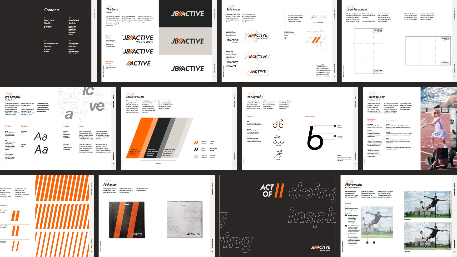
I was asked to redefine the JB ACTIVE branding across multiple formats. By defining the brand more clearly, the company could not only target specific target audiences, but also show up consistenly, lead with confidence and cater to the ever changing sports market, both online and offline. The identity was designed as retail first, ensuring every touch-point from digital to physical speaks the same language.
The identity is focused on a The brand identity is focused on the celebration of moving from beginner to pro, celebrating the pureness of sport and the deep connection between participant, equipment and training.
Whether you’re starting out or have reached a high-level of excellence, JB//Active has the widest range of sporting goods taken care of by friendly, approachable and knowledgeable staff.
About the Project
JB Active required a modernisation to their existing identity.
First flagship store in Fourways utilising the new brand identity.
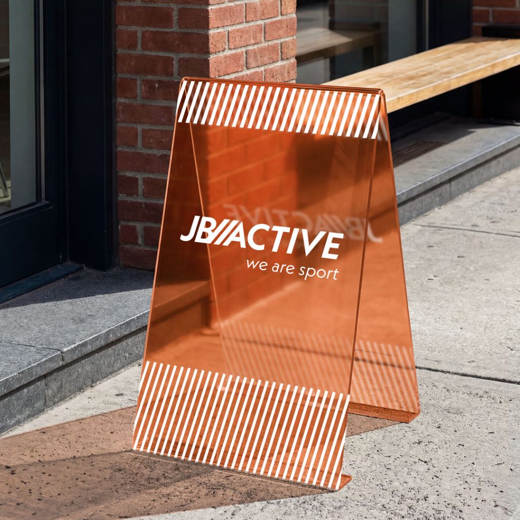
The concept centers on duality and the movement from beginner to pro. The angled lines and varying thicknesses and spacings allow for a dynamic graphic element to help delineate between different gear types, but also divides the store environment, guiding shoppers to the correct area.
Whether you’re starting out or have reached a high-level of excellence, JB Active has the widest range of sporting goods taken care of by friendly, approachable and knowledgeable staff.