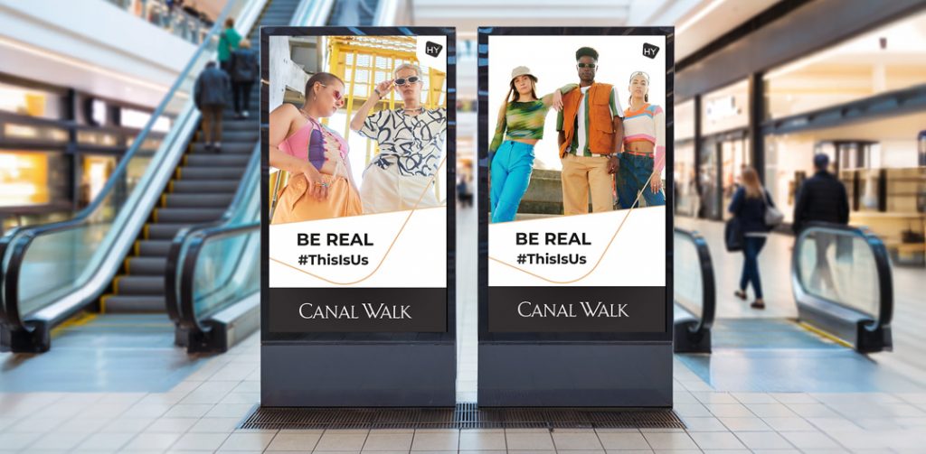
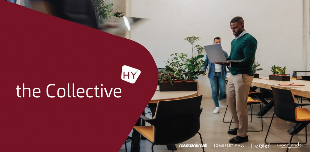
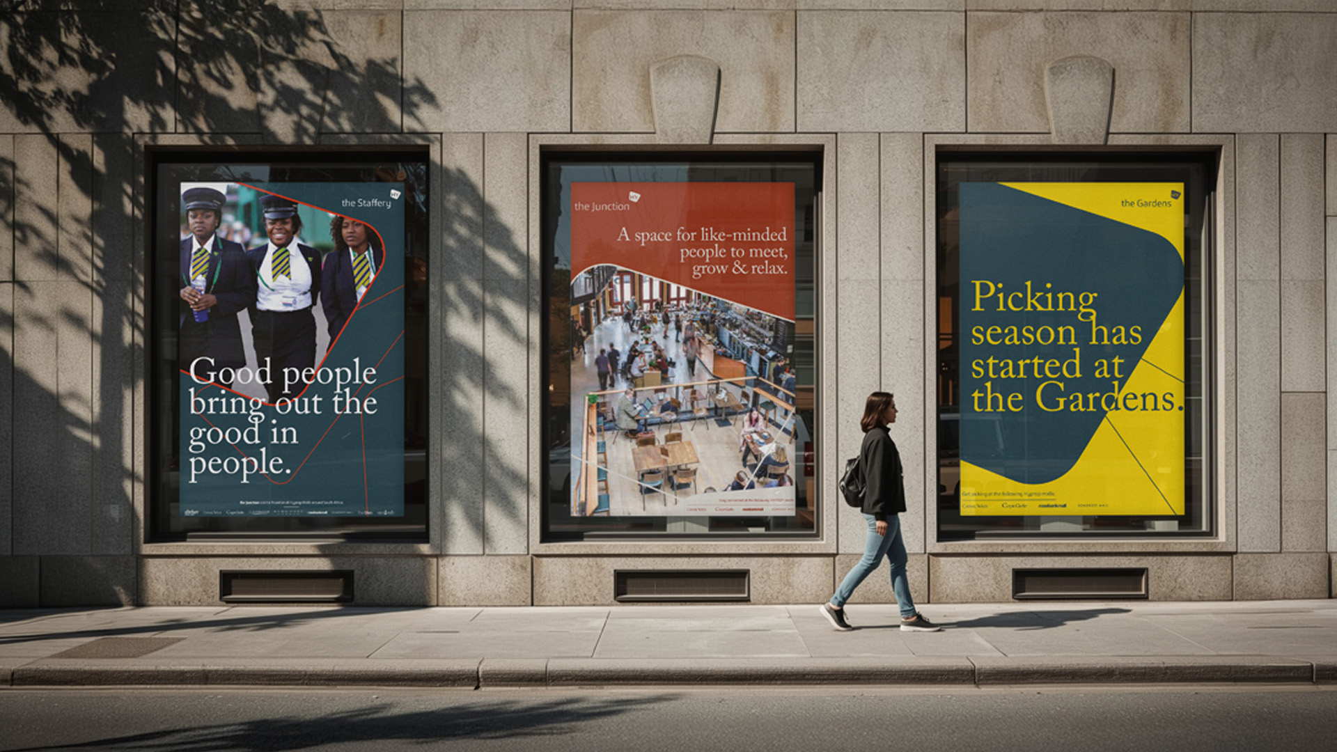
The Hyprop Brand serves as a complete identifier and golden thread, acting as a mark of quality and expectation for a regional portfolio of shopping centres.
Lorem ipsum dolor sit amet, consectetur adipiscing elit. Ut elit tellus, luctus nec ullamcorper mattis, pulvinar dapibus leo.
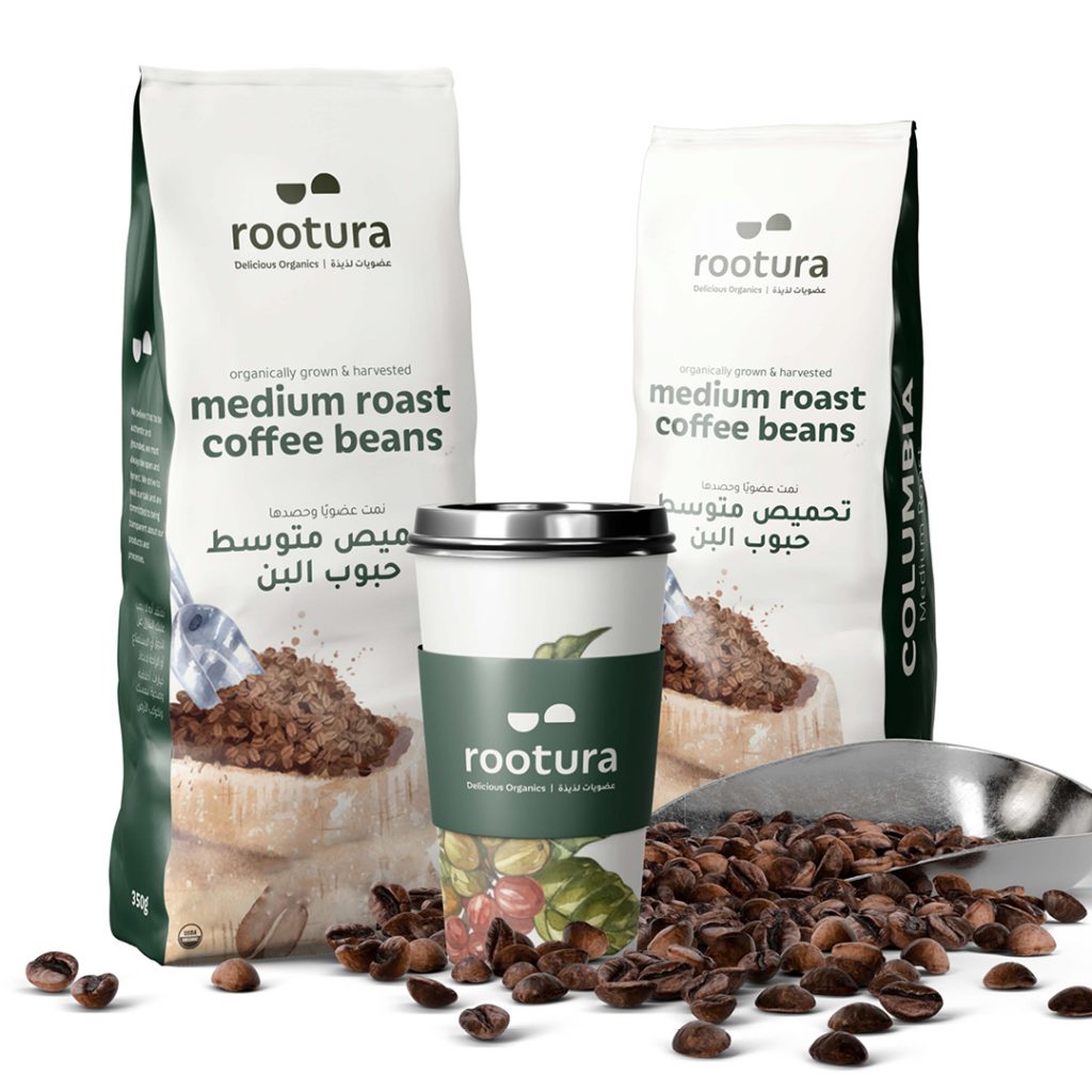
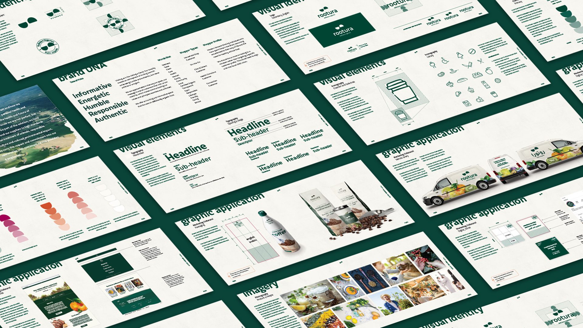
Rootura is an Organic food market offering customers European quality organic produce, for both a supermarket and dine-in experience.
The graphic language created evokes a sense of rawness and ‘messyness’, similar to what you would expect on a farm.
Rootura is an Organic food market offering customers European quality organic produce, for both a supermarket and dine-in experience.
The graphic language created evokes a sense of rawness and ‘messyness’, similar to what you would expect on a farm.
BRAND STORY
Context
Barrow-in-Furness is no ordinary town. With world-class engineering and manufacturing at its core, it plays a vital role in the UK’s defence and security.
Now, backed by £220m of government investment, Barrow faces unprecedented global attention. Its future depends not only on regeneration but on reshaping its identity. We needed to tell a story as ambitious as the mission it serves. A story that would mobilise communities, industry, and government alike.
The challenge
Barrow’s opportunity was clear, but three sharp challenges stood in the way:
A fragmented vision – competing voices without a unifying purpose.
Perception barriers – dismissed as a ‘pipe-dream project’ not a town of national importance.
Need for momentum – a platform capable of inspiring belief and attracting investment.
Our impact
A unifying idea – we created Barrow Rising, a bold narrative uniting regeneration, economic ambition, and national defence under one powerful story.
Strategic clarity – our POINT Strategy aligned local, regional, and national stakeholders, giving Barrow a single voice and a roadmap to act decisively.
Credibility and action – launching the website, the Plan for Barrow and targeted campaigns, we built a living platform to engage communities, attract global investment, and drive long-term transformation.
Why it matters
Barrow Rising shows how the right strategy, combined with powerful storytelling, can reshape a town’s identity – transforming local ambition into a mission of national importance.
For us, it reinforces our role as a trusted partner to critical industries – simplifying complexity, unifying stakeholders, and amplifying belief in futures that matter.
The store graphics reflect the brand created in a subtle, but important manner. All the elements add to the brand experience, from the paired back navigational devices to the full-height wall graphics. Every aspect has been considered for a customers viewpoint. Working with the client on the Brand DNA, driven by concept, allowed alignment and understanding between client, brand and retail design.
At just over 1200Sqm, this new offering will captivate and engage all who enter its doors.